How to create a realistic peeling sticker effect in Sketch
Learn how to design a realistic sticker from scratch using your favorite design tool
Some people might use Sketch exclusively for UI design — but it can do a lot more than that. From realistic illustrations to eye-catching icon design, Sketch has all the tools you need to create great things.
Today, we’re going to be exploring how you can use a few quick methods to create a peeling sticker design. These are great for adding some character to your other creations, or just for sharing with your friends!
Let’s get started…
How to design a peeling sticker effect — step by step
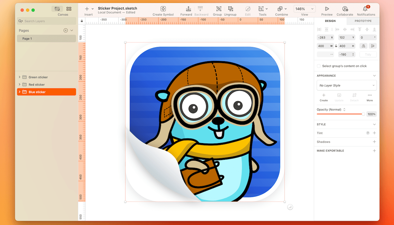
Before we jump in, let’s get a quick look at the end result:

For this demo, we’re using Maria Letta’s free Gopher pack, which has a ton of fun designs
1. Create your sticker background
First, create a 400x400 pixel Artboard, and add an equal-sized rectangle of the same size on top of it. Use the handles on the Canvas to set a corner radius of 90 using the rounded corner style. Next, add a linear gradient using three colors of your choice — we’ve gone for a few shades of blue — #4A9EEE, #1F57DA and #28368D. Position the gradient so it starts in the top-right corner and moves down diagonally. Then add a white (#FFFFFF) inner border with a width of 11.
2. Add a pattern
Now we’re going to give the background a little more texture with a lined background. First, create a rectangle that’s 400x20 pixels, then duplicate it and move it down below the first so there’s an 18 pixel gap between the two. Then, duplicate it a few more times — either by selecting both rectangle and dragging the handle down, or by using ⌘D. The new shapes should automatically space themselves so they’re the same distance apart.
Once you’ve got enough to cover your whole sticker (you should need 11 rectangles), select them all and use Union to make them a combined shape. Then add a linear gradient to the whole shape with three points. They’ll all use #FFFFFF, but the Alpha will reduce from 100, to 40, to 0 as the gradient progresses. Position it in the same place as the gradient from the last step.
3. Mask the pattern
Next, position your combined shape above the sticker rectangle, then set the sticker rectangle as a mask. Change the line pattern’s blending mode to ‘Color’ and decrease its opacity value to 20%. You should end up with a pattern that sits on top of your colored background, and fades away as it progresses down to the lower-left corner.
4. Insert and mask your image
Now it’s time to add an image to your sticker — the main subject for your design! Grab any PNG with no background and place it onto the sticker, above the combined shape layer from the previous step. Because your sticker rectangle is already behaving as a mask, it will also mask the PNG.
For this demo, we’re using Maria Letta’s free Gopher pack, which has a ton of fun designs.
5. Create the fold

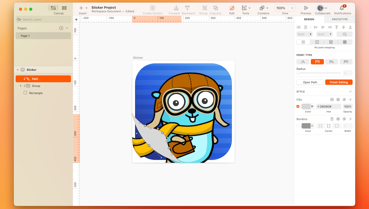
Now it’s time to create the folded corner of your sticker. Press V to select the Vector tool, and use it to draw a triangle. Then hold ⇧ and click on each straight edge to add three more points in the middle of each one.
Change their point types to Mirrored, then move them and adjust the handles to add some curves to each side as in the image above. Then change the top-right corner to Mirrored as well, and curve it to make it look like the curved corner of the rectangle shape.
6. Add a realistic gradient and shadow
Now that you have the fold shape in place, it’s time to make it look more realistic. Give it a linear gradient moving diagonally down and to the right, using the pale grey colors — #FFFFFF, #C9D1D7 and #C9D1D5. Then add a subtle shadow to your new shape, with the X offset at -6, the Y offset at 6, and a blur value of 25. You can use the default gray, but we recommend you reduce the opacity a little.
7. Add a shape under the sticker
Now you just need to hide the rest of the sticker under the fold! Draw another shape to cover it, set the color to #FFFFFF, and position it under the fold layer. That’s it — your sticker is complete!
8. Try some different shapes and designs!

Now you’ve got one sticker, why not try switching up the shape of your sticker, or trying different background patterns and foreground imagery. Soon you’ll have a whole sticker collection to share!
And there you have it. A fun, realistic sticker that you can add to your website, app mockups, or maybe even turn into a real sticker. Whoa, that’s meta.
If you like what you’ve made, we’d love to see it! Share it with us on Twitter using the hashtag #MadeWithSketch.


